This case study explores how I built a comprehensive design token system by leveraging the newly introduced Figma Variable features to enhance its functionality and integration.
Context
Lotic.ai is creating an ecosystem with various products, but as more products continued to join the Lotic ecosystem, we increasingly noticed inconsistencies within the existing design system across different products. Such issues are common, particularly in a rapidly growing startup environment, but they pose a significant challenge to the scalability of the design system and its ability to accommodate new requests, such as multi-theme support.
Problem
Inconsistency:
The design system exhibits inconsistencies across various products, including:
Mixed use of hard-coded values (e.g., color hex codes) and Figma styles.
UI elements that do not align with the Lotic brand.
Scalability:
The design system struggles to scale effectively:
It cannot accommodate new requests, such as supporting multi-theme brands or light mode (the main app started with dark mode).
It struggles to integrate with new products.
It lacks support for testing purposes.
Target audience
Design team:
The current design system hampers the growth of the design team and their ability to collaborate effectively.
Onboarding new designers is time-consuming, and they often face confusion when creating new components.
The design team struggles to collaborate effectively due to the lack of a standard visual language, leading to inconsistent design outputs and inefficient workflows.
Engineer team:
The engineering team finds it difficult to implement components due to inconsistent styles.
Product team:
The product team faces challenges when creating tickets that specify requirements, due to the lack of a standardized design system.
Project goal
The primary goal of this project was to address the inconsistencies and scalability issues within the existing design system at Lotic.ai. Specifically, the objectives were to establish a unified design language across all products, streamline the integration of design tokens to support multi-theme and light mode functionalities (we started off by dark mode), and improve overall scalability to accommodate new products and future design requests.
Research
My research focused on:
What design tokens are and their origins.
The benefits of using design tokens.
How other companies manage their design tokens.
Ensure that each token is clearly defined.
Create an intuitive token taxonomy
The token system is structured into two levels: Primitive tokens and Component tokens.
Primitive tokens
Primitive Tokens are the foundational elements of the token system, each assigned specific values for various properties, such as colors, spacing, or shape. For instance, tokens might be labeled as "Primary 50," "Secondary 200," or "Tertiary 500." These labels provide a clear and consistent naming convention for these values without specifying their contextual use in design. This ensures that the tokens are easily referenced and applied across different design elements.
Component tokens
Component Tokens bridge the gap between primitive tokens and their practical application in design. They link the fundamental values, such as "Primary 100," to specific design functions or elements, like "color-text-primary." This approach assigns context to the primitive values, making it clear how they should be used in different design scenarios. By defining tokens in this way, the system ensures consistency and clarity in how design properties are applied across various components.
Component token type
In this project, component tokens include the following types: color, shape and spacing tokens. Below are details about each type.
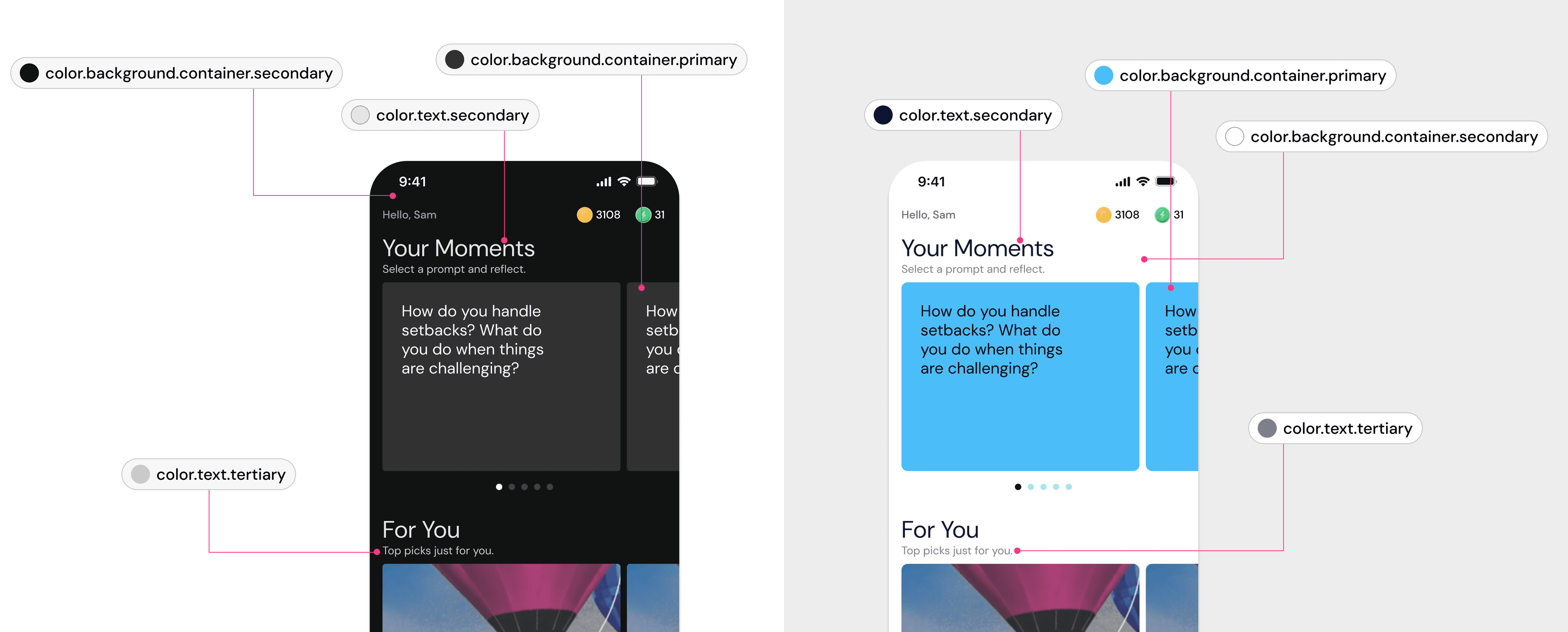
Type 1: Color tokens
In the primitive token collection, I assigned hard-coded values to names such as Primary.100: #C2CEFE. For the component tokens, I established a naming convention that clearly defines each token using the following structure: Category - Property - Item - Variant - State - Scale. This approach, ordered from the most generic to the most specific, aligns with industry standards revealed through my research.
Type 2: Shape tokens
The Shape token, especially the radius token, ensures consistency in defining the corner radius of components. In the primitive token collection, I used the T-shirt sizing method to categorize these tokens. For component tokens, the naming follows this structure: Category - Property - Item - Variant - State - Scale.
Type 3: Spacing tokens
The spacing token ensures uniformity in defining the spacing both within and between components. In the primitive token collection, I adopted a scale from 1 to 24, with corresponding values ranging from 4 to 96 pixels. This approach provides a clear and consistent way to manage spacing sizes. For component tokens, the naming convention follows a structured format: Category - Property - Item - Variant - State - Scale.
Support multi-theme system
The token system supports a multi-theme design system. With the introduction of Modes in Figma Variables, we can easily switch between different modes and themes by just dragging and dropping frames across various parent layers. When I was presenting this project to the entire company, I created a playful Barbie theme for our product, which brought a lot of laughs, especially since the Barbie movie was a summer hit.
Workshop and audit
After establishing the naming conventions for the primitive and component tokens, I organized a workshop with another designer to audit all the components in the design system. This workshop allowed us to review each component and map the tokens to their real-time application in the design. It also provided an opportunity to address and correct inconsistencies as we conducted the audit and mapping.
Testing
To ensure the token system's effectiveness, both the design and engineering teams conducted thorough testing. The design team used the tokens in various design scenarios to evaluate their applicability and consistency across different components. We tested how well the tokens integrated with existing design elements and verified that the system maintained visual coherence. Simultaneously, the engineering team implemented the tokens in the codebase to assess their functionality and ease of use. We ran tests to confirm that the tokens were correctly applied and that any updates or changes were reflected accurately in the user interface. Feedback from both teams was collected to identify and address any issues, leading to refinements that enhanced the overall robustness of the token system.
Handoff and implementation
I worked closely with the engineering team to implement the token system on the backend. To support their efforts, I created a detailed design specification that serves as a definitive reference for both engineers and designers using the design tokens. This document evolves alongside the token system. I also organized a presentation for the entire engineering team, including Lotic’s overseas team in Europe, where we reviewed and discussed the system and addressed their questions.
Throughout the implementation process, I frequently assisted with technical issues and responded to engineers' inquiries. Based on their feedback, we iterated on the token system to refine and improve it.
Presentation and team training
Once the token system was implemented, I introduced it to the entire company during our company-wide event known as Wed Show & Tells. The presentation was a success and generated significant interest in the design system. Additionally, I organized a series of training sessions for the design team to ensure they were well-acquainted with the new system and could effectively integrate it into their workflows.
Measuring success
The design token system enabled the design team to maintain consistency and scalability across different platforms. It also facilitated the implementation of new requests, such as light mode and partnership branding themes, effectively supporting evolving design needs.
Thinking
When I was structuring the tokens, an engineer asked,
"Why do we need different levels of tokens? Can we just hard-code the values in component tokens?"
This question prompted me to reflect on the rationale behind the entire token system. There are several reasons for using multiple levels of tokens. First, primitive tokens provide a consistent foundation by defining basic values like colors and spacing in a centralized manner. This consistency ensures that design elements are uniformly applied across the system; Second, component tokens build on these primitive tokens by linking them to specific design functions and contexts, such as defining how a color is used for text or backgrounds. This layered approach enhances scalability, as changes to primitive tokens automatically propagate through component tokens, simplifying updates and maintaining coherence; Lastly, separating tokens into different levels allows for greater flexibility and adaptability in design, supporting various themes and design requirements without the need for hard-coding values directly into components.
Learning
Building the design token system at Lotic.ai was a challenging yet rewarding experience. I learned that creating a comprehensive token system requires not just technical knowledge but also a deep understanding of the design needs and challenges faced by various teams. The iterative process of refining tokens based on feedback from both design and engineering teams highlighted the necessity of ongoing communication and collaboration.
Another significant learning was the value of thorough documentation and training. Providing a detailed design specification and conducting training sessions helped bridge the gap between design and implementation, ensuring that the token system was used consistently and effectively across the board.
Summary
Creating a comprehensive design token system is no easy task that requires careful consideration and a balance of strategic thinking, expertise, and collaboration. The challenge intensifies when the system must cater to diverse design needs and evolving requirements. Success in this endeavor involves integrating thoughtful planning with user-centered methodologies, including interviews, research, user testing, and workshops to ensure that the system is both effective and adaptable.
- Deanna Glaze, Senior Director, UX and Design
