This case study covers the story of how design deals with legal, behavioral science and product team to help Lotic users who are in distress find support and help.
Context
As a wellness company, Lotic.ai is committed to supporting users who may be in distress or at risk of harm. The Clinical Beaconing Project was a vital initiative designed to offer resources when users' language suggests they might pose a threat to themselves or others. This feature plays a critical role in the Lotic.ai platform by directing users in need of help to appropriate external resources. Beyond its importance as a safety measure for users, the functionality also helps safeguard Lotic by fulfilling necessary legal responsibilities.
The project had been paused before I took it on, with an existing wireframe designed by another designer. However, when I restarted the effort, I chose to revisit the problem from the ground up, leading the project to completion within 2 months.
Team
Suzanne Button / Katie Penry / Anne Park / Gavin Patient / Ashton Harper / Stephanie Padula / Mood Moral / Laurenne Sala / Justin Toledo
Target audience
Lotic users who are experiencing distress while using the product who share the following traits:
Heightened emotional states: Users may experience anxiety, sadness, fear, or frustration, impacting their ability to engage with complex interfaces.
Limited patience and focus: Users may struggle to concentrate, leading to a preference for clear, simple, and direct interactions.
Urgent need for support: Users are often seeking immediate assistance and reassurance, requiring the system to respond promptly.
Sensitivity to language and tone: Gentle, non-judgmental language can foster trust and comfort, as users may feel vulnerable.
Seeking reassurance or validation: Users might look for content that acknowledges and normalizes their feelings, helping them feel understood and less isolated.
Problem
The core problem we aimed to solve was how to provide timely and accessible support to users in distress who might pose a threat to themselves or others.
Given the sensitivity of the situation, the solution needed to be simple, easy to understand, and engaging, while avoiding complex user flows, complicated UI design, long blocks of text, and difficult legal terms or language that could overwhelm users in distress.
Project goal
How can we transform complex, dry legal language into a simple, approachable, and even engaging design that allows a person in distress to easily seek help and take action, while still adhering to legal regulations?
Constraints
NLP technology:
Natural Language Processing (NLP) is used to identify harmful words in users’ audio recordings. Initially, the approach involves hard-coding a predefined list of harmful words, which will trigger the workflow directing users to a list of external, supportive resources. This method was chosen for its ability to be deployed quickly. However, as Lotic's Wisdom Engine evolves, the data science team plans to explore more advanced and nuanced approaches for detecting and flagging risk, allowing for a more sophisticated and flexible system in the future.
Legal compliance:
The legal team required strict adherence to complex compliance rules, involving lengthy text and multiple steps. From a user experience standpoint, however, the design needed to be simple, straightforward, and minimize steps wherever possible. The challenge was to balance these legal requirements with a more user-friendly approach.
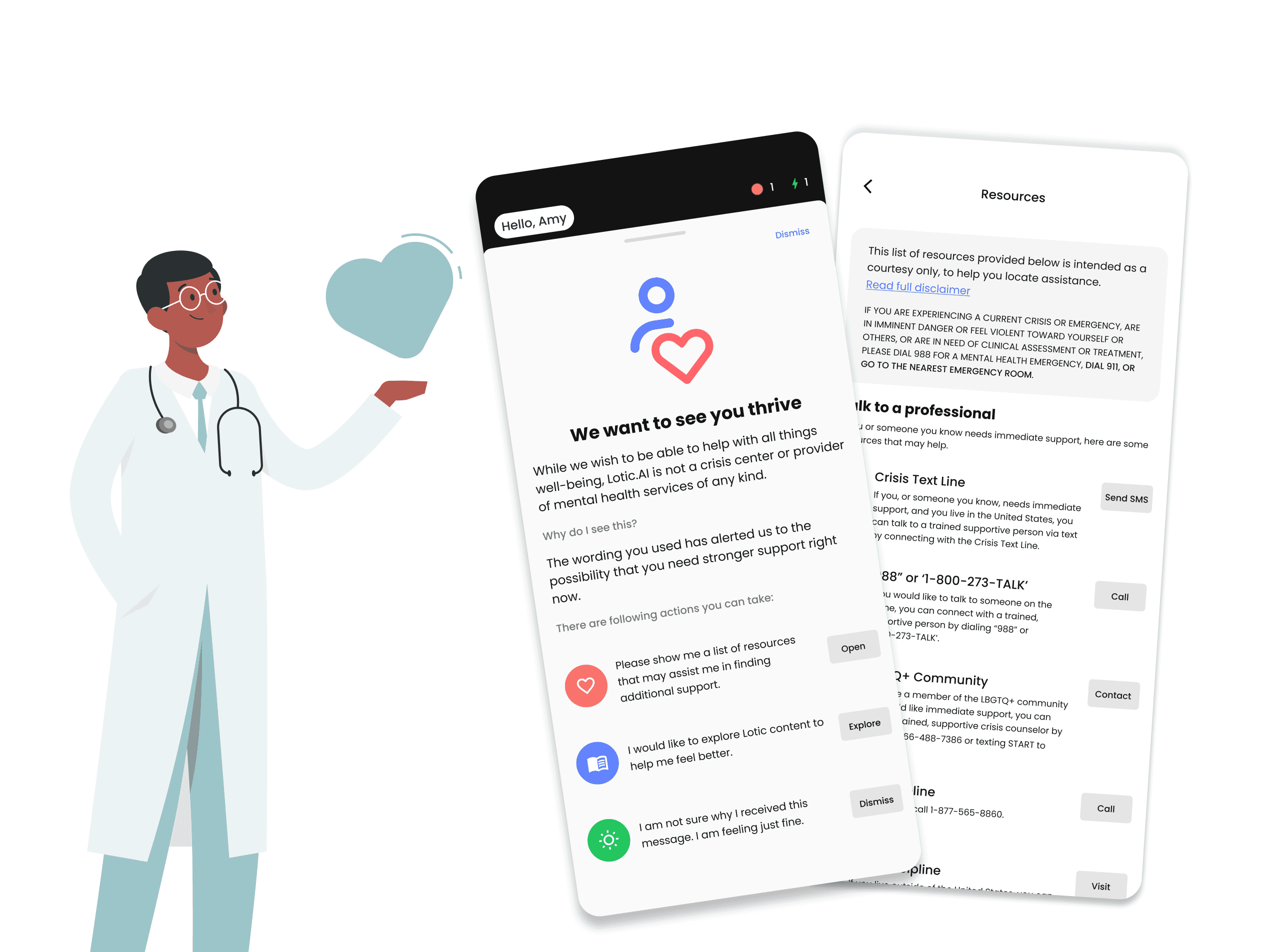
A, If the system detects potentially harmful words or phrases, the beaconing feature is activated. For the design of this page, my goal was to create a feeling that evokes calm, warmth, and positivity.

B, Long blocks of text can severely impact the user experience, especially for individuals in distress who may not have the time or capacity to read through lengthy content. One of the key priorities in designing the beaconing feature was to shorten the text and improve readability.
The image below illustrates how I progressively reduced the text length through multiple rounds of discussions with the legal team.

C, The existing wireframe initially presented a flow with too many steps, so I explored ways to simplify it while still meeting legal requirements. I designed two versions:
- Version A moved the '911' information to the top of the Resources Page, reducing the number of steps in the flow.
- Version B combined the '911' information with the disclaimer, also streamlining the flow.


After comparing the two options, we chose Version 1 for the following reasons:
The legal team required the '911' information to be readily accessible at all times.
Combining the '911' info with the disclaimer made the text overly long, decreasing readability.
D, The Resources Page is a key element of the beaconing feature, as it's where users can access immediate support and assistance. The goal in designing this page was to make it well-organized, easy to read, and quick for users to find the help they need.

E, I designed two versions of the Resources Page: dark mode and light mode, but initially, I wasn't sure which one to choose. Since the Lotic app primarily uses dark mode, keeping the Resources Page consistent with that design seemed logical. However, dark mode can make reading slightly more difficult and may evoke negative emotions. From my competitor analysis, I also discovered that light mode is commonly used for pages offering help and support. Taking this into account, I decided to go with the light mode for a more positive and accessible experience.

Proxies
We tested the feature with users who were not in immediate distress but could provide valuable feedback on the interface's clarity and ease of navigation. These participants were asked to imagine themselves in stressful situations, which allowed us to assess how intuitive the user flow was and how quickly users could locate help.
First-time user
We ran usability tests with users unfamiliar with the app to simulate how a first-time or distressed user might navigate the interface. By focusing on how easily participants could understand the prompts and complete the necessary steps, we gathered insights into potential pain points or confusion.
Feedback from stakeholder
We were seeking feedback from stakeholders including the clinical behavioral science team, which was invaluable in shaping the final design. Their expertise provided insights into how users in distress might react to certain elements, such as long blocks of text or complex navigation, and helped us adjust the design accordingly.