
Redesign for California Native Plant Society Homepage
This UI design is part of a UI challenge called September Saturation Challenge that I attended to practice and improve my design skills. In this challenge, I would do a UI design within a week with a set of colors required. Even though it is a UI challenge, I still follow the basic UX design process from problem definition to user research to visual design but in a simplified way.
Color: #14281D, #355834, #6E633D
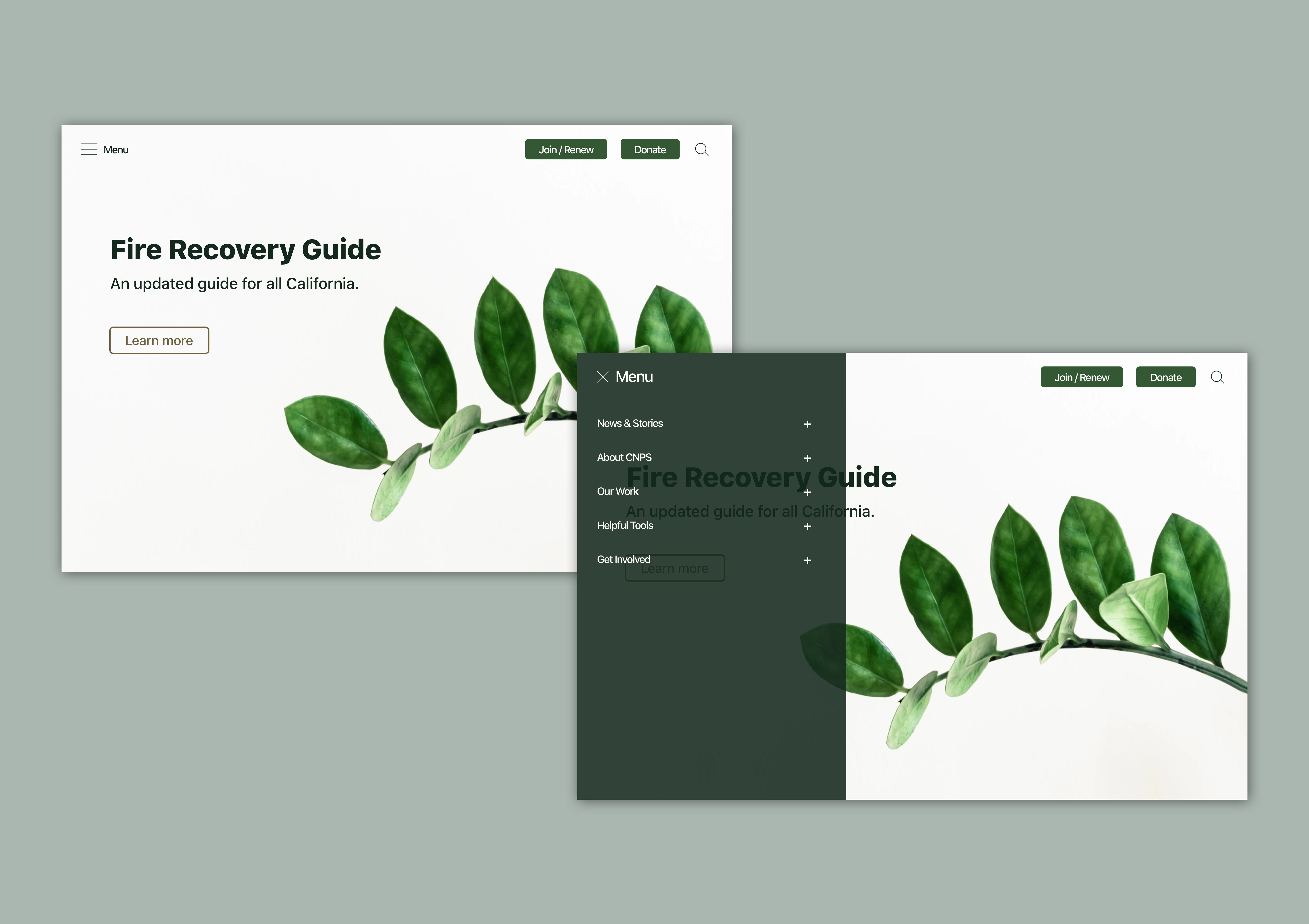
The color combination of the week reminds me of the forest and recovery. Recently California is suffering as the wildfires rage. So I am thinking of designing for recovery from the wildfires and protection of our forests. In this challenge, I am redesigning the website for California Native Plant Society. I redesigned the UI of the fire recovery guide page to make it look more clean, and easy to read. I also reorganized how the information is displayed, moving from horizontal navigation to vertical navigation. With vertical navigation, there's more flexibility with the amount of links that can appear.
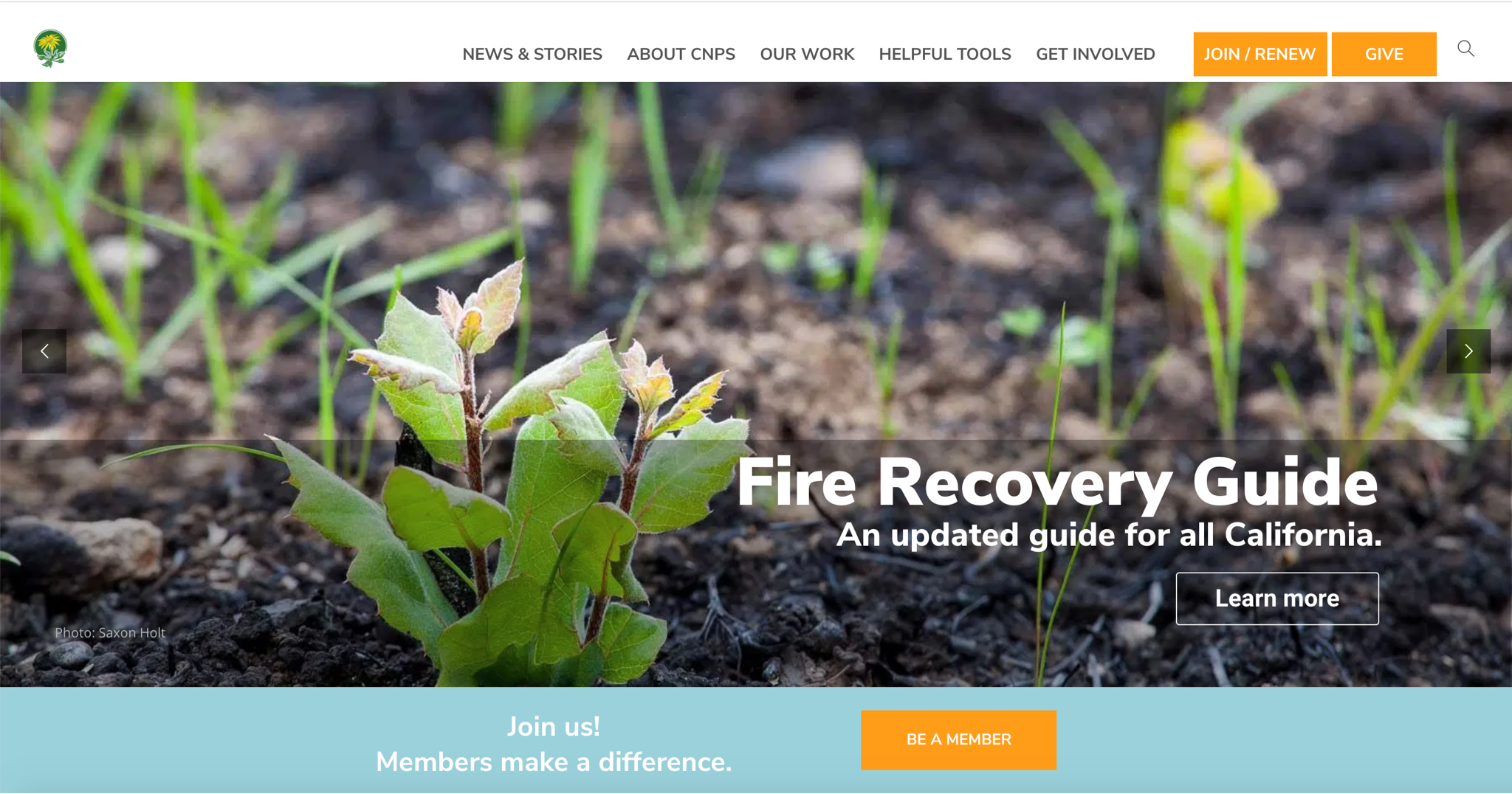
Original Design
Highlight
One of the biggest changes that I made here is to redesign the horizontal navigation to vertical navigation, which could hold more links and give more flexibility. There are 8 items in the horizontal navigation which could be more legible if the vertical navigation is applied.
Tools
Sketch
Please let me know what you think and how you would like it to be improved. Hope you like my design and care our forest as well!